Research & Discovery
I conducted a benchmark analysis of major financial platforms (e.g., JustETF, Morningstar) to understand how investors interact with ETF data and portfolio tools. While these platforms are highly comprehensive, the abundance of information, filters, and asset choices can be overwhelming for early-stage investors. Many users struggle to translate large data sets into clear decisions.
To better understand these pain points, I interviewed beginner and intermediate investors and analyzed discussions in online finance communities. From this research, several insights emerged:
• Users feel overwhelmed by too much information and want help interpreting it
• Guided paths and simplified choices increase confidence
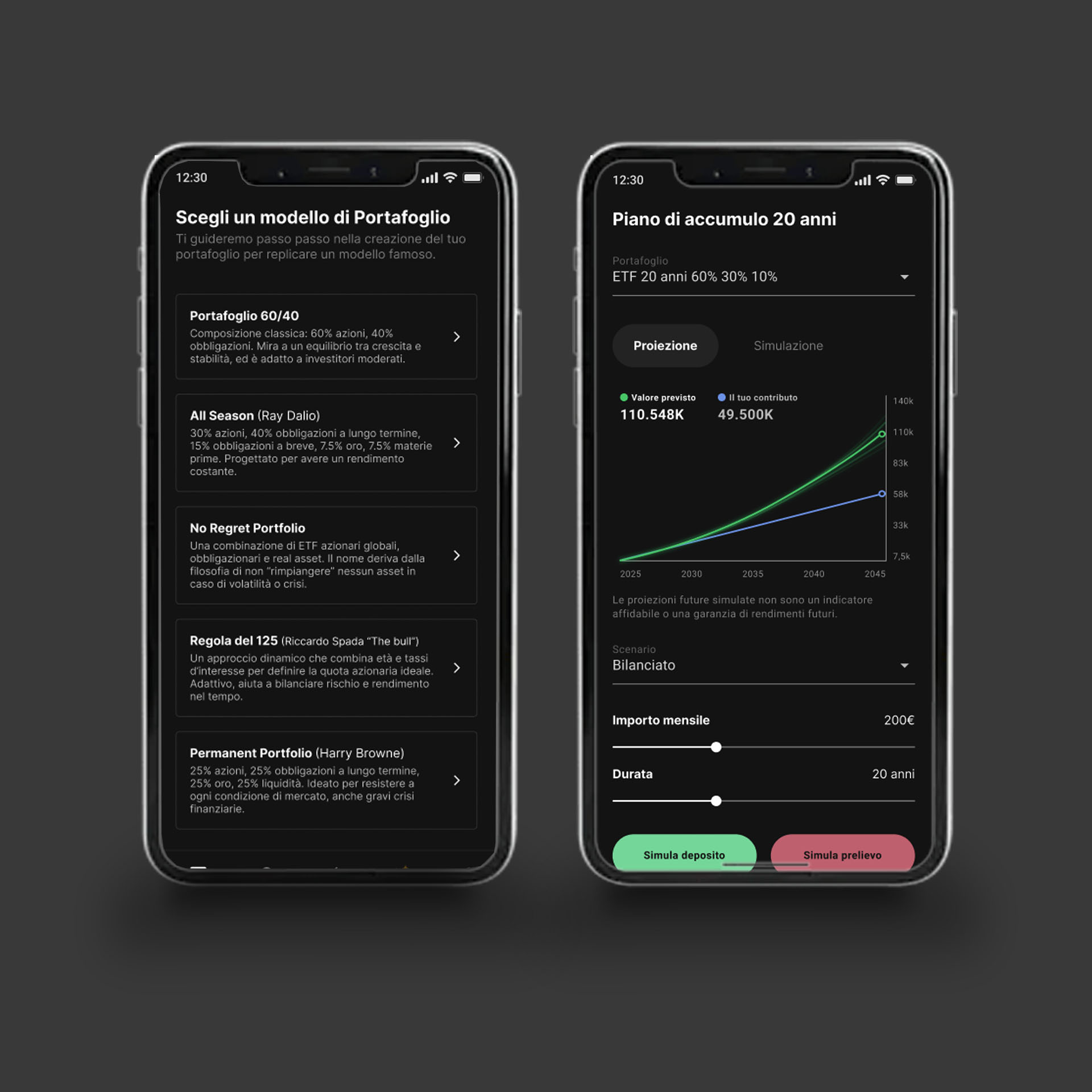
• Visual, high-level explanations improve understanding and trust
• Mobile users expect streamlined workflows, not full replicas of complex desktop interfaces
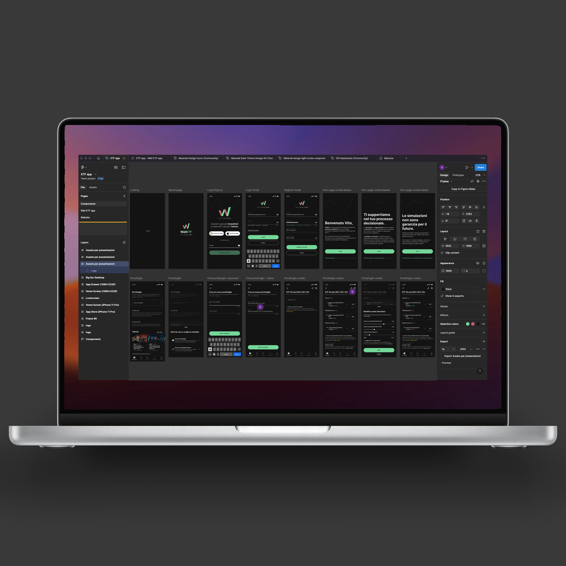
These insights guided the UX strategy: instead of presenting all available data at once, WallETF introduces curated model portfolios, simplified comparisons, and a small set of essential metrics. This approach reduces cognitive load while still offering depth for users who want to explore further.