Checkout


Checkout hero

Project Overview

I redesigned the checkout experience with a step-by-step flow featuring a unified UI across all countries and advanced error handling. The new checkout provides a streamlined, consistent experience that guides users through the purchase process with clarity and confidence.

The goal was to create a modern, conversion-optimized checkout that reduces friction, minimizes user hesitation, and provides a seamless experience across all markets while maintaining code quality and ease of maintenance.

The Problem

The old checkout was a mix between one-page checkout and multi-step that had a low conversion rate. Users had many second thoughts at the payment step due to a UX that showed too much information at the wrong moments.

Key issues included:

  • Low conversion rate — poor performance compared to industry benchmarks
  • User hesitation — many users reconsidered at the payment step
  • Information overload — too much information displayed at inappropriate moments
  • Technical debt — difficult to maintain due to years of modifications without code refactoring
  • Inconsistent experience — lack of unified UI across different countries
  • Poor error handling — insufficient feedback and guidance for users

The checkout had become a critical bottleneck that required a complete redesign to improve conversion rates and maintainability.

Checkout problem context

Research & Discovery

I conducted a comprehensive benchmark analysis of leading e-commerce checkout experiences to understand best practices and industry standards. I analyzed user behavior in the checkout through both analytics and Noibu session recordings to identify friction points and abandonment patterns.

Throughout the research phase, I maintained constant communication with stakeholders to align on requirements, understand business constraints, and ensure the solution would meet both user needs and business objectives.

Key insights from the research:
Information timing — showing too much information at once increases hesitation
Progressive disclosure — revealing information step-by-step improves completion rates
Mobile-first approach — most users complete purchases on mobile devices
Error prevention — advanced error handling reduces frustration and abandonment

Based on these insights, I created a complete Figma prototype with a unified flow and mobile-first UI that addressed the identified pain points while maintaining consistency across all countries.

UX & UI Design

I created a complete Figma prototype with a unified flow and mobile-first UI that ensures consistency across all countries. The design emphasizes progressive disclosure, showing only the information needed at each step to reduce cognitive load and user hesitation.

The UI features a clean, step-by-step interface with clear visual hierarchy, intuitive navigation, and advanced error handling that provides immediate, helpful feedback to guide users through any issues they encounter.

Special attention was given to timing information display, ensuring that users see relevant details at the right moments in their journey, preventing information overload that previously caused abandonment at the payment step.

This approach resulted in a streamlined, conversion-optimized checkout experience that significantly outperforms the previous solution.

Project Management & Go Live

Throughout the project, I served as Project Manager and Business Ambassador, acting as a bridge between the business and tech teams. I facilitated communication, aligned requirements, and ensured that both technical implementation and business objectives were met.

After deployment, I identified bugs introduced by the launch using a combination of quantitative and qualitative analysis. I tracked user losses in the checkout funnel through analytics, extracted user identifiers, and searched for those sessions in Noibu to review customer recordings and identify specific problems.

I worked closely with the development team to resolve issues quickly, ensuring minimal impact on user experience and conversion rates. This iterative approach, combined with my role as a liaison between business stakeholders and technical teams, allowed us to address problems as they emerged and continuously improve the checkout experience.

A/B Testing
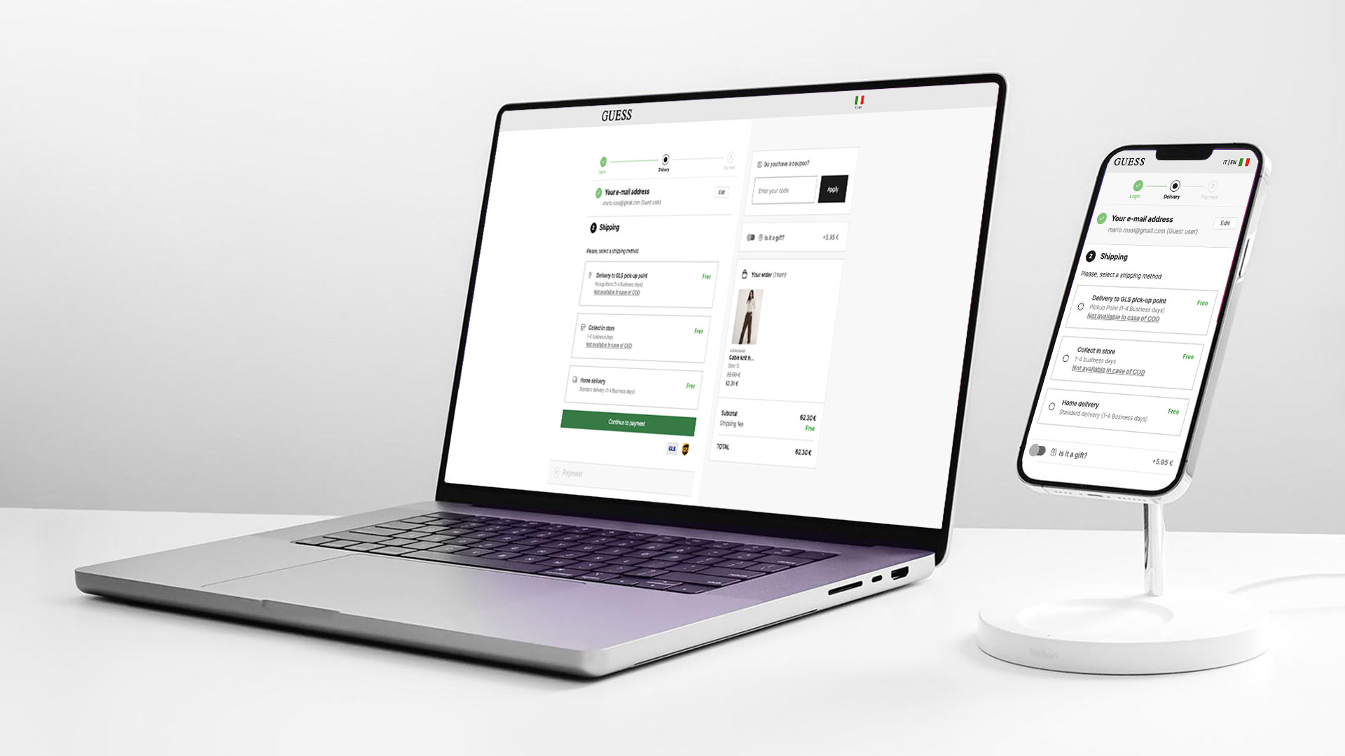
I conducted an A/B test comparing two versions: one with an extended checkout showing collapsed subsequent steps, and another where those steps were not visible. The second variant won decisively, confirming that progressive disclosure and reduced information visibility significantly improve conversion rates.

Results & Impact

The redesigned checkout delivered excellent conversion results compared to industry benchmarks, significantly outperforming the previous solution.

Key achievements:

  • +28% conversion rate increase — substantial improvement in checkout completion
  • +15% mobile conversion improvement — mobile-first approach proved highly effective
  • Reduced abandonment — fewer users reconsidering at the payment step
  • Improved maintainability — clean codebase enables easier future updates
  • Unified experience — consistent UI across all countries improves brand perception
  • Better error handling — advanced error management reduces user frustration

The checkout now performs significantly above industry benchmarks, demonstrating the effectiveness of the step-by-step approach, progressive disclosure, and unified UI design.